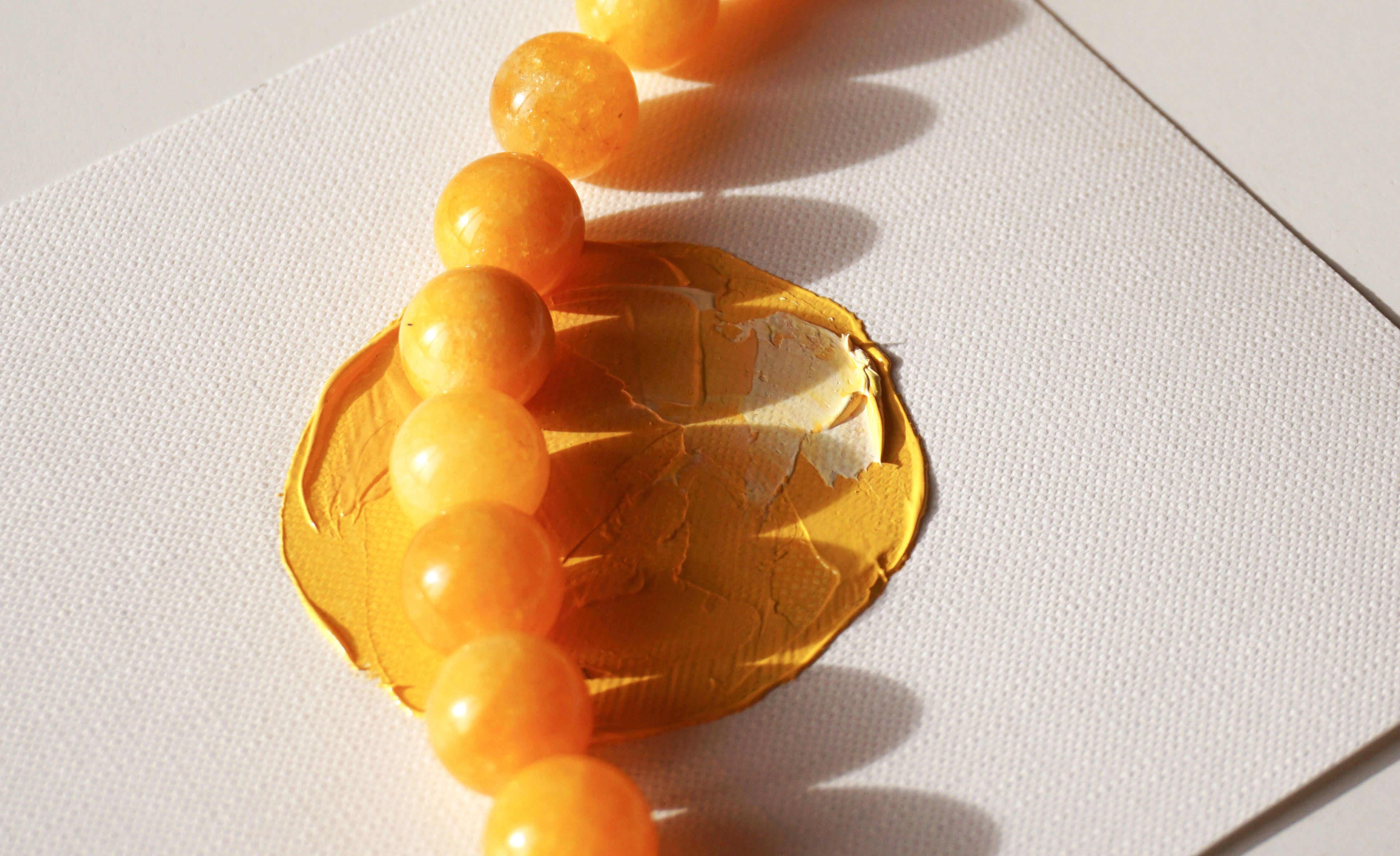
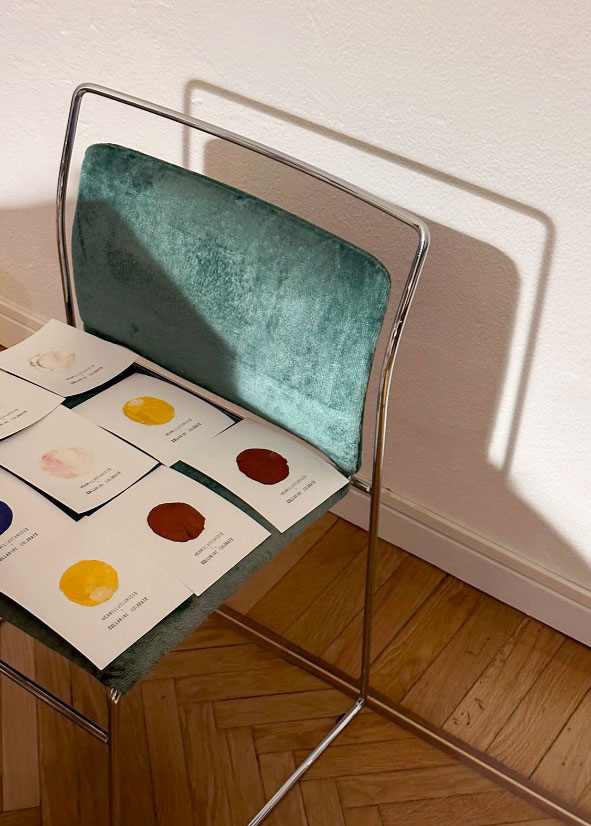
Collaninecolorate is an artisanal brand with a fresh and delicate character. I was asked to deal with the redesign of the logo along with a communication initiative at the launch of the new collection. Following the logo, I then made oil-painted cards for the brand to accompany their products.
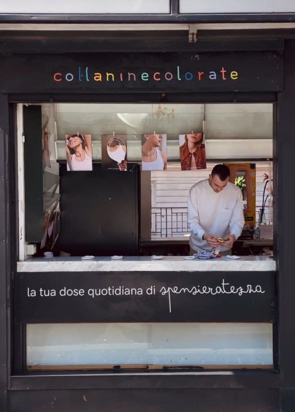
Below is the starting point of the previous logo. For the logo redesign, I investigated the most representative themes of the brand and the founders: craftsmanship, care, playfulness. I analyzed the previous logo, maintaining the salient features while modifying the stroke.


Research on current brand communication was developed and the intention was born to expand the brand's communicative universe, associating artistic expression and creative sensibility with communication.
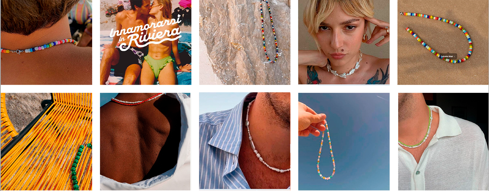
Following the analysis, it was decided to intervene by keeping the characteristics of the current logo and softening the stroke. The logo was thought of as a metaphor for the necklace, a regular and varied succession of characters, like beads.
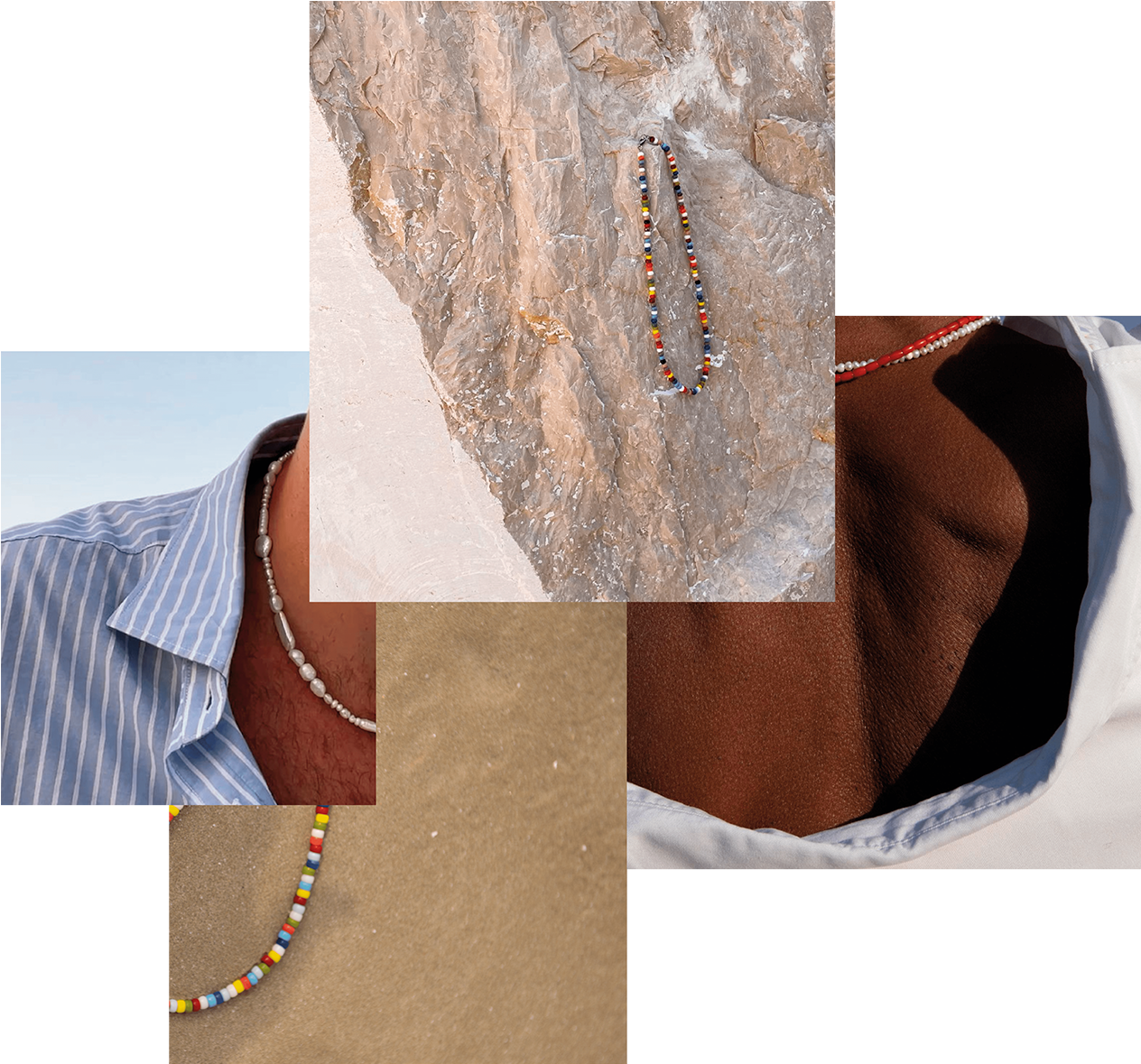


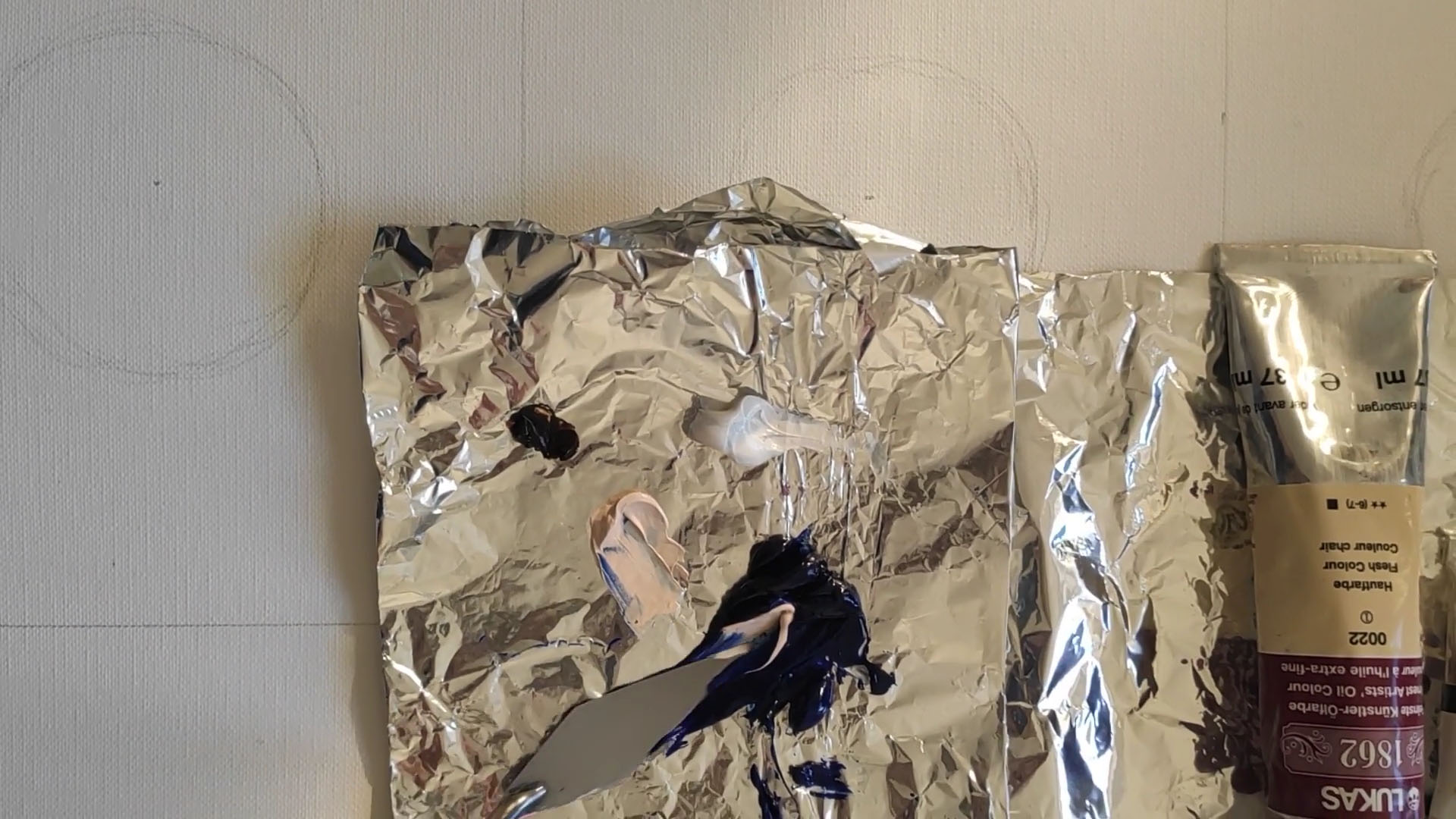
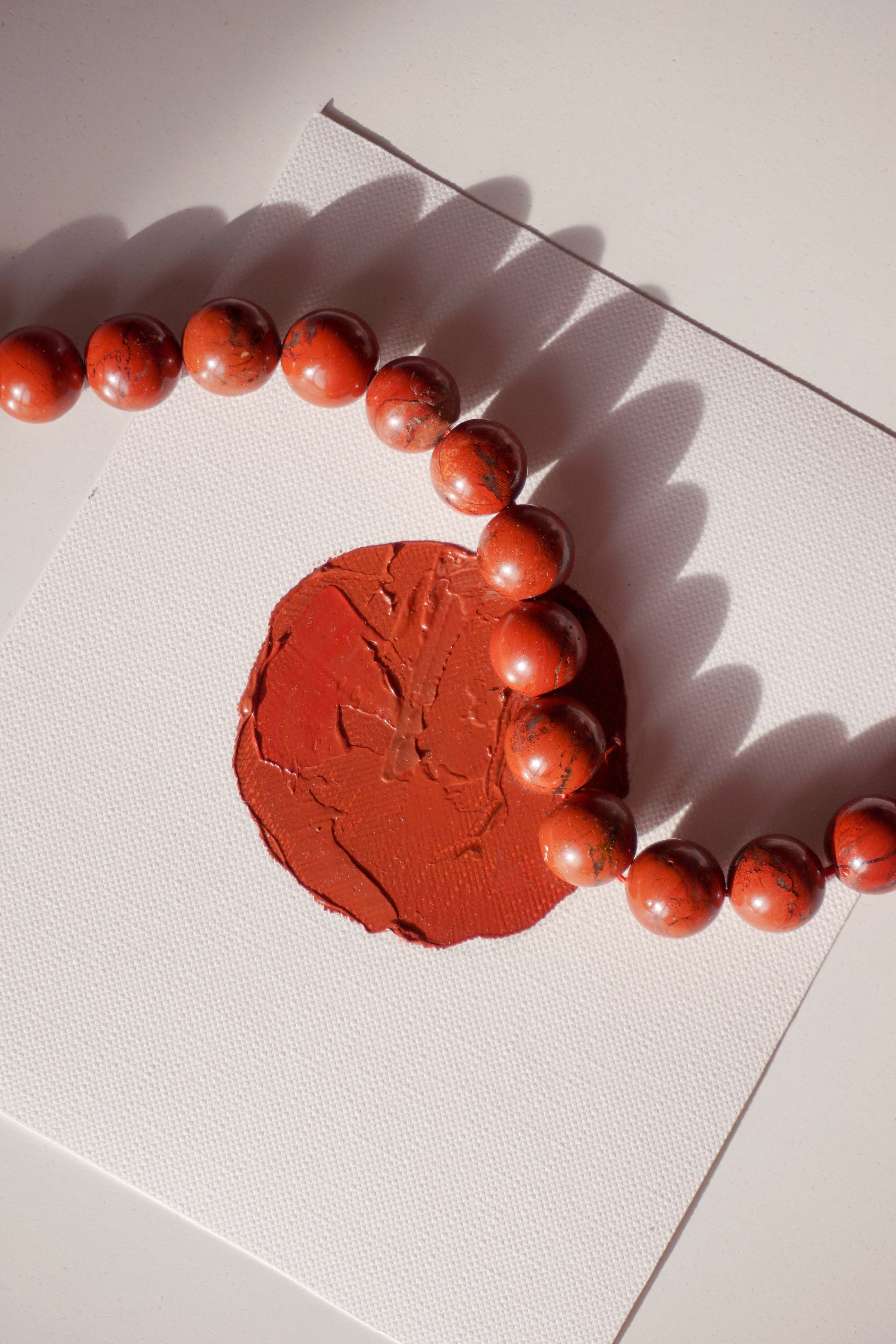
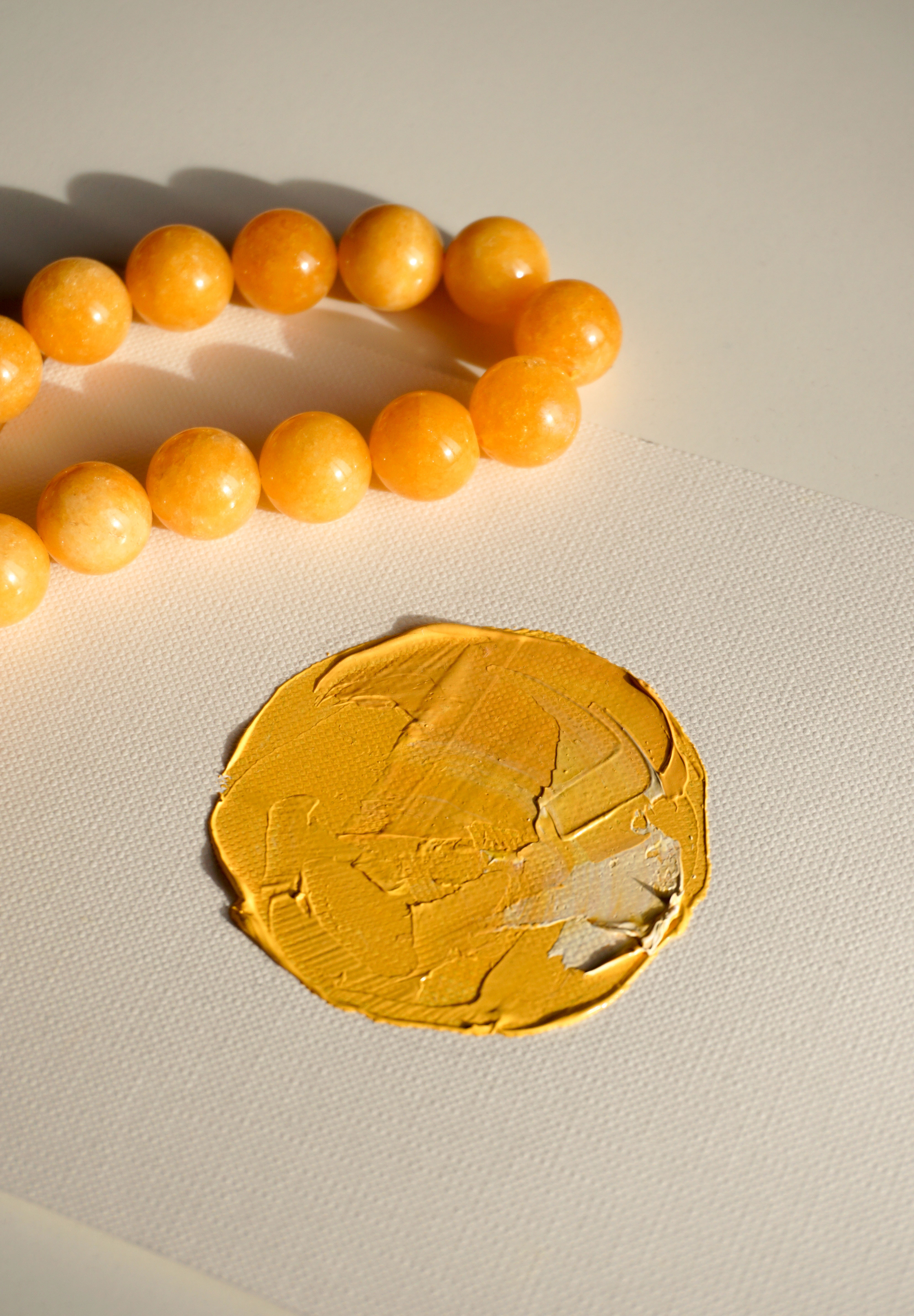
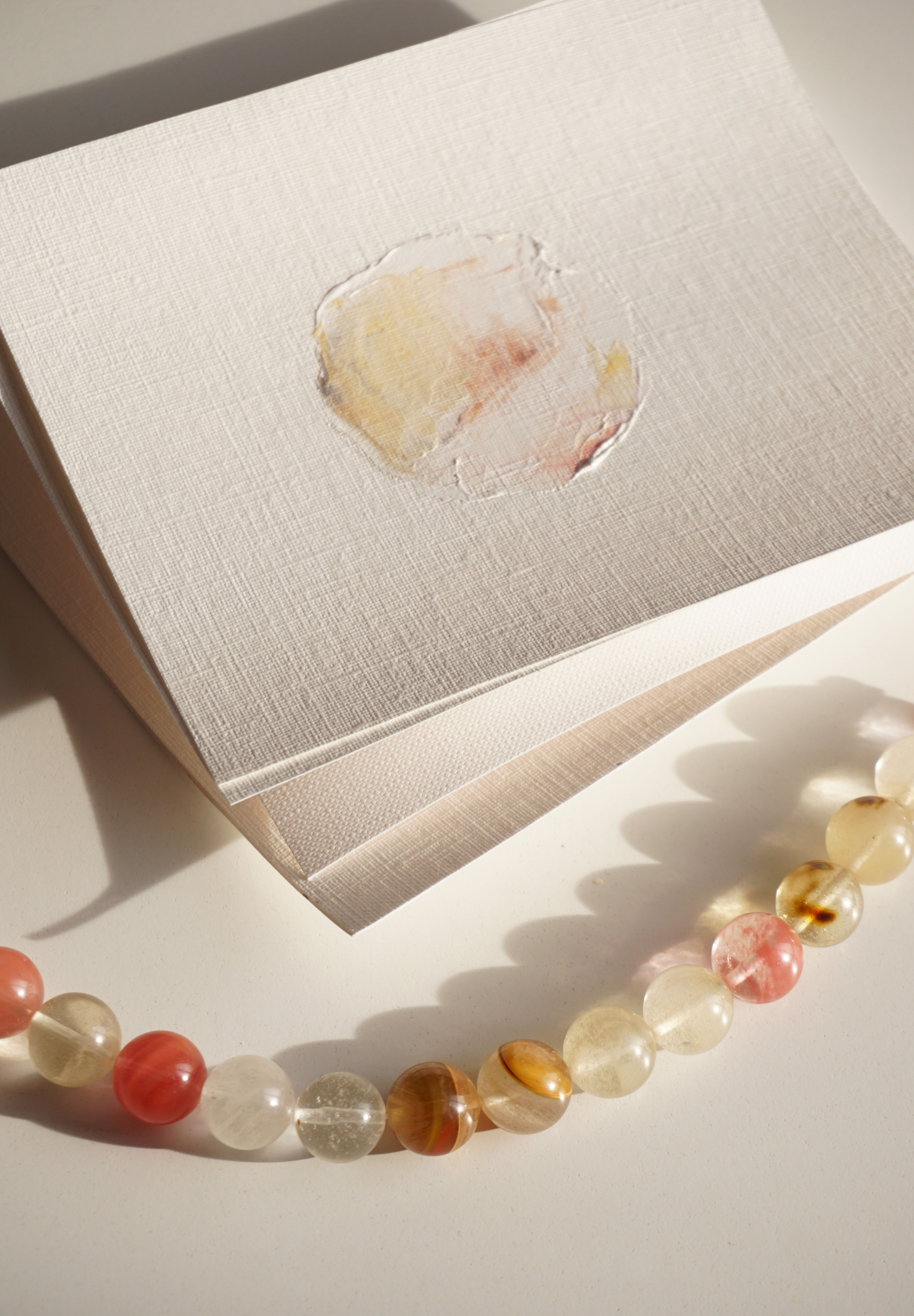
From the new collection of necklaces, characterized by larger beads, the idea was born to make cards that would enhance the element of the spherical bread and the craftsmanship.
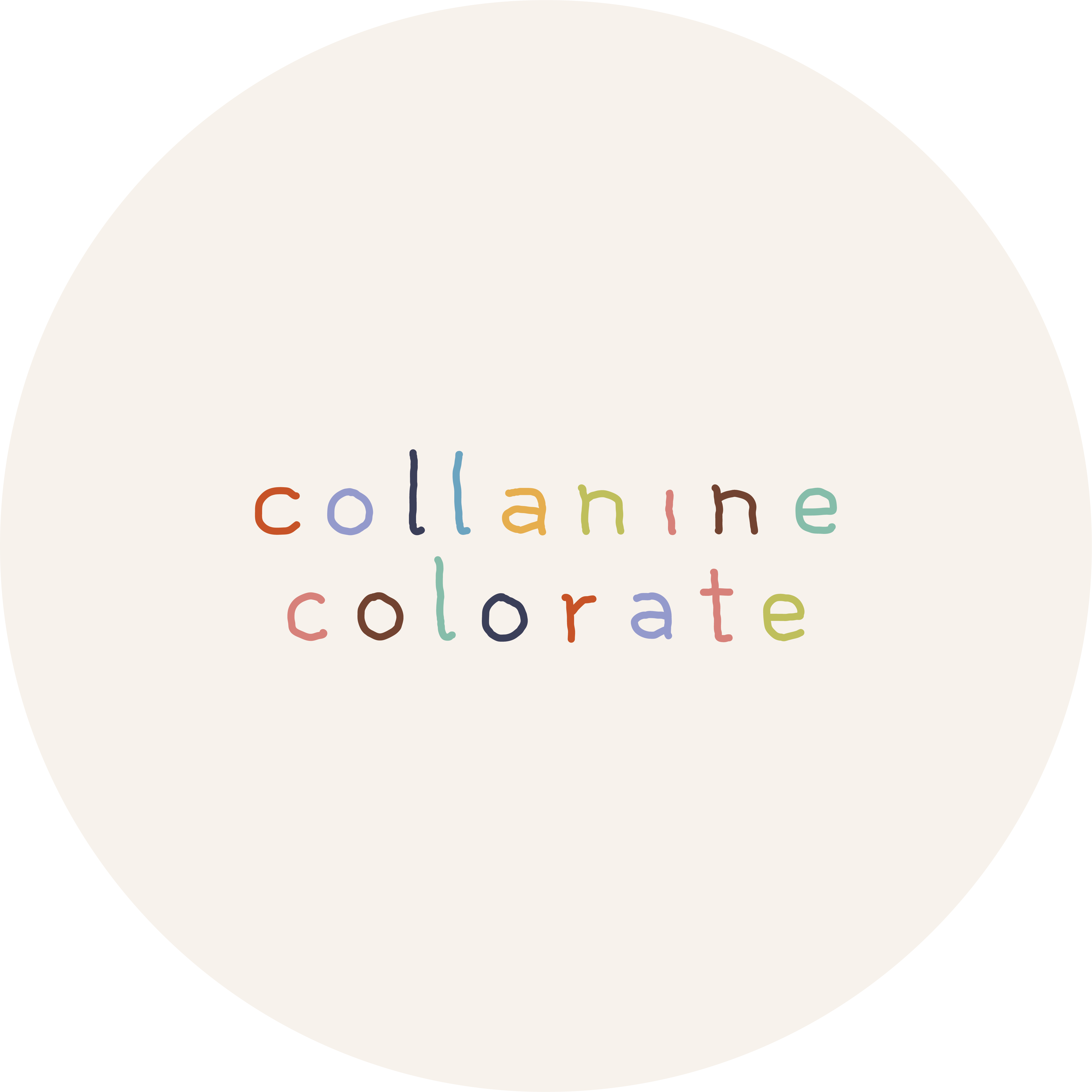
The final logo features a soft, slightly irregular, handwritten stroke. The spacing between the characters and the drafting recall the structure of a necklace. The colours retain variety but have been extracted from images used in brand communication and the products themselves.

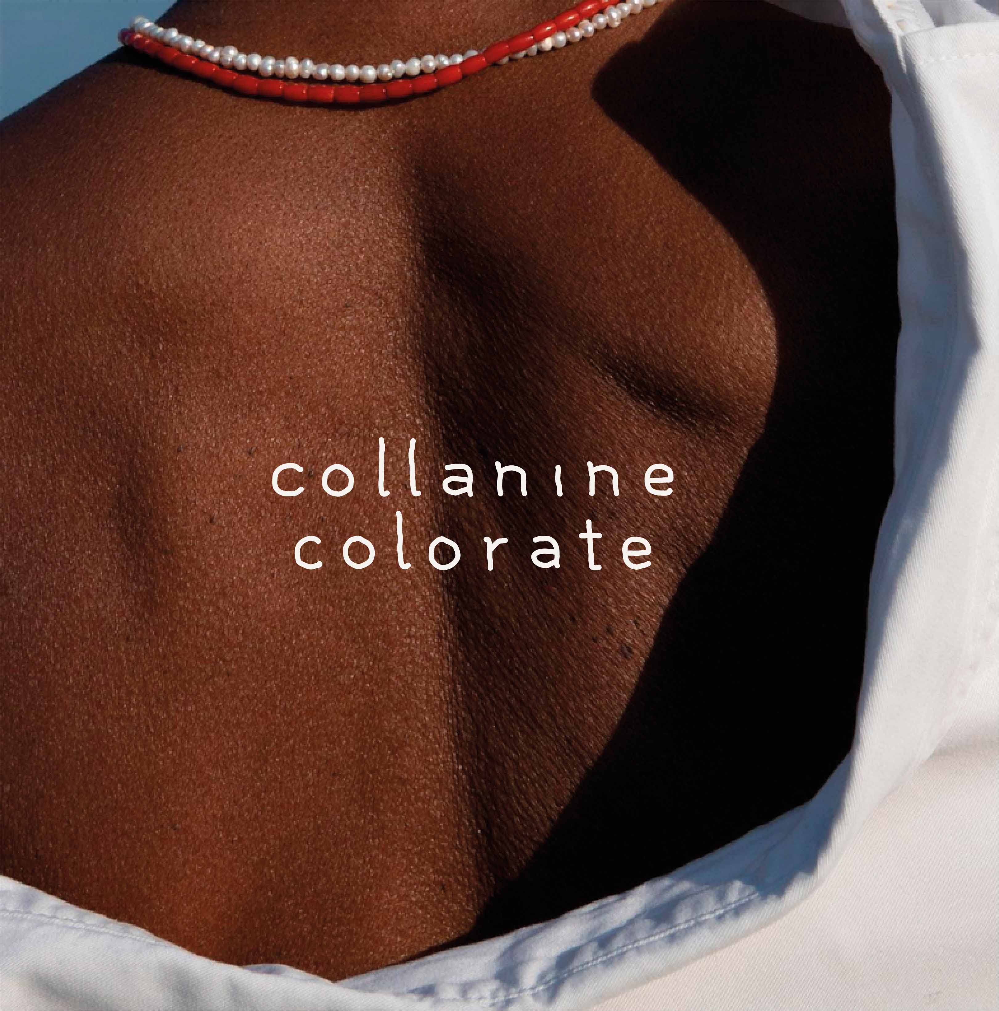
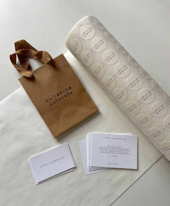
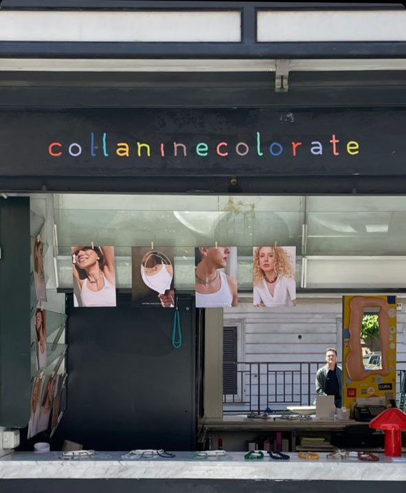
Regarding the new communication cards: I made 4 variants of cards as the 4 colour variants of the necklaces. A card is sent with each purchase along with the corresponding necklace. Each card is different and unique, as does each bead.
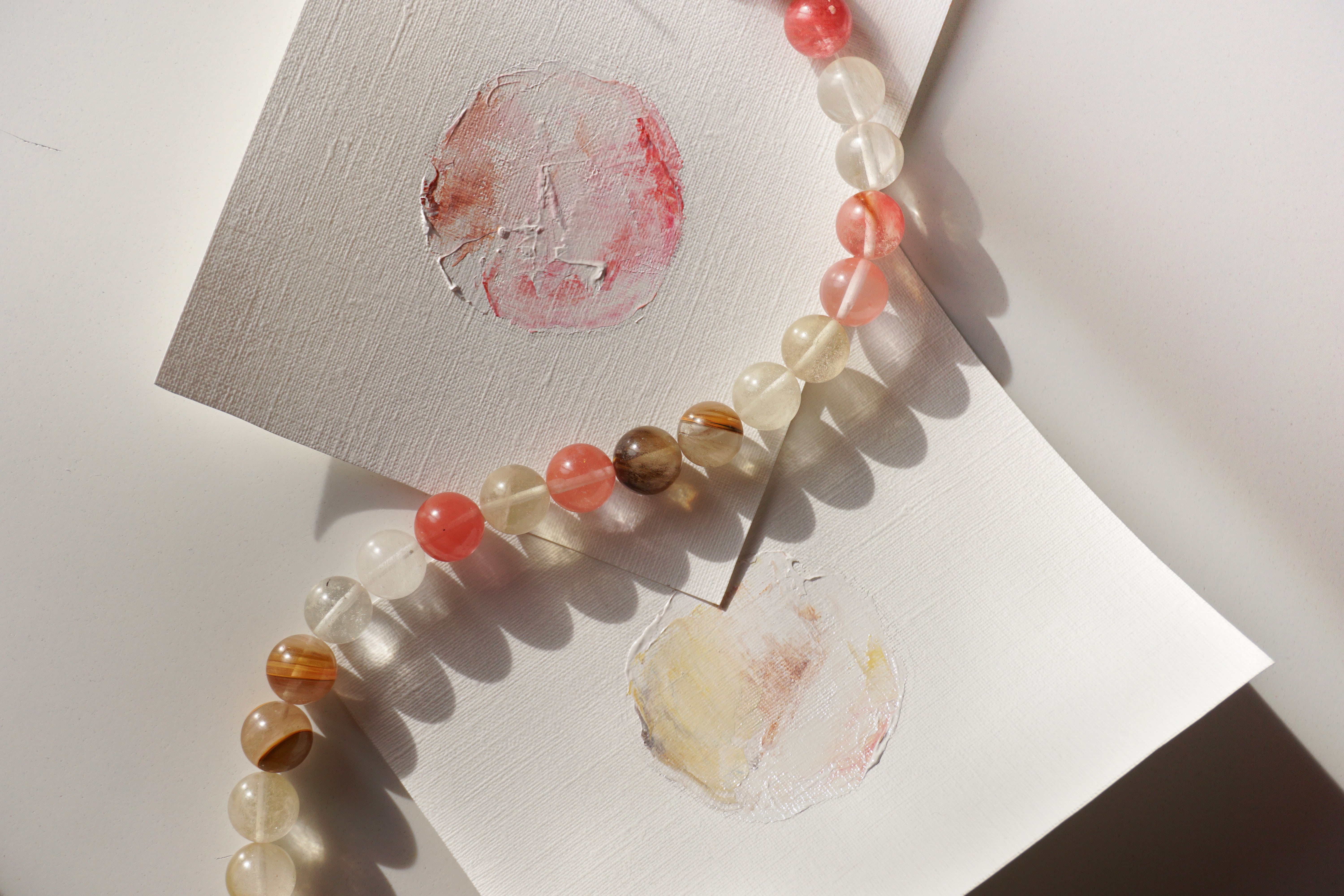
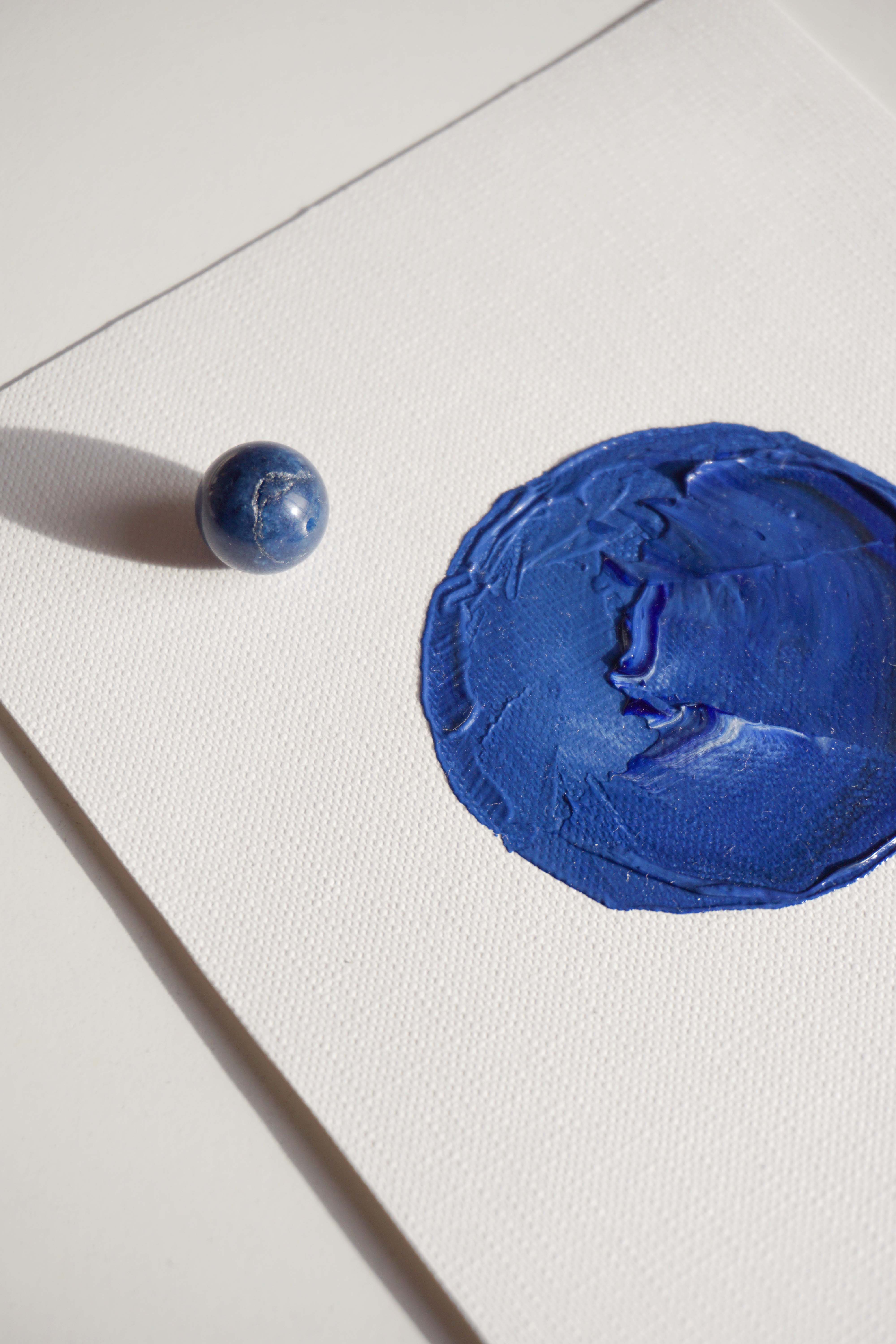
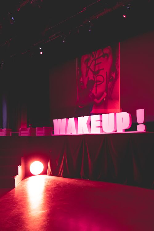
It was my honor to give a talk on this work, made for collaninecolorate, entitled "Innamorarsi della Riviera" at WAKEUP! DREAMSIGNERS at the Parma Fair on March 3, 2023.

Individual work project.